Auto white balance or Kelvin? What do you use? While auto white balance (AWB) offers convenience, there’s a world of control and creativity waiting to be unlocked through the Kelvin scale.
Let’s rewind to a time when I relied solely on AWB, thinking I could correct any color discrepancies in post-production. It seemed like the logical choice—why bother with manual settings when technology could handle it?
AWB, while handy, often falls short in capturing the exact color temperatures we envision. Have you ever noticed your photos coming out with an unnatural tint or feeling slightly off-color? That’s where the Kelvin scale steps in and transforms your workflow.
Understanding the Kelvin Scale
At its core, the Kelvin scale allows you to manually adjust the color temperature of your images. It’s measured in degrees Kelvin (K), offering a spectrum from warm to cool tones. Let’s break it down:
- Lower Kelvin Values (2000K-4000K): Imagine the warmth of candlelit scenes or cozy fireplaces. These values yield images with a reddish-orange or yellowish tone, perfect for creating intimate atmospheres.
- Middle Kelvin Values (5000K-6000K): Enter the realm of neutrality and daylight balance. Think of this range as your go-to for accurate color representation, similar to the natural light experienced on a clear day.
- Higher Kelvin Values (7000K and above): Cool down your images with these values, evoking the blueish hues of overcast or shaded light. They create a crisp, bluish-white aesthetic, ideal for modern and edgy compositions.
It’s worth noting that the Kelvin scale’s measurement in degrees might initially seem counterintuitive. Why isn’t 7000K associated with warm candlelight, while lower values signify cooler tones? Think of it in terms of heat intensity. A freshly lit candle emits warmer, red-orange hues (lower Kelvin values) compared to the intense heat and bluish tones of a bonfire (higher Kelvin values). It’s science meeting artistry in the realm of photography.
Why Dive into Kelvin?
- Speedy Editing: AWB often leads to individualized white balances per shot, turning batch editing into a color-correcting nightmare. Kelvin changes the game. Set your white balance in-camera to your desired Kelvin value, aiming for accuracy rather than perfection. This streamlined approach transforms your editing process, saving time and ensuring uniformity across your portfolio.
- Consistency is Key: Imagine a product photoshoot transitioning from natural light to studio lighting. With AWB, each change in lighting conditions introduces color shifts, disrupting your visual narrative. Kelvin maintains harmony, preserving your intended color palette regardless of environmental changes. This consistency elevates your brand’s identity and strengthens your visual storytelling.
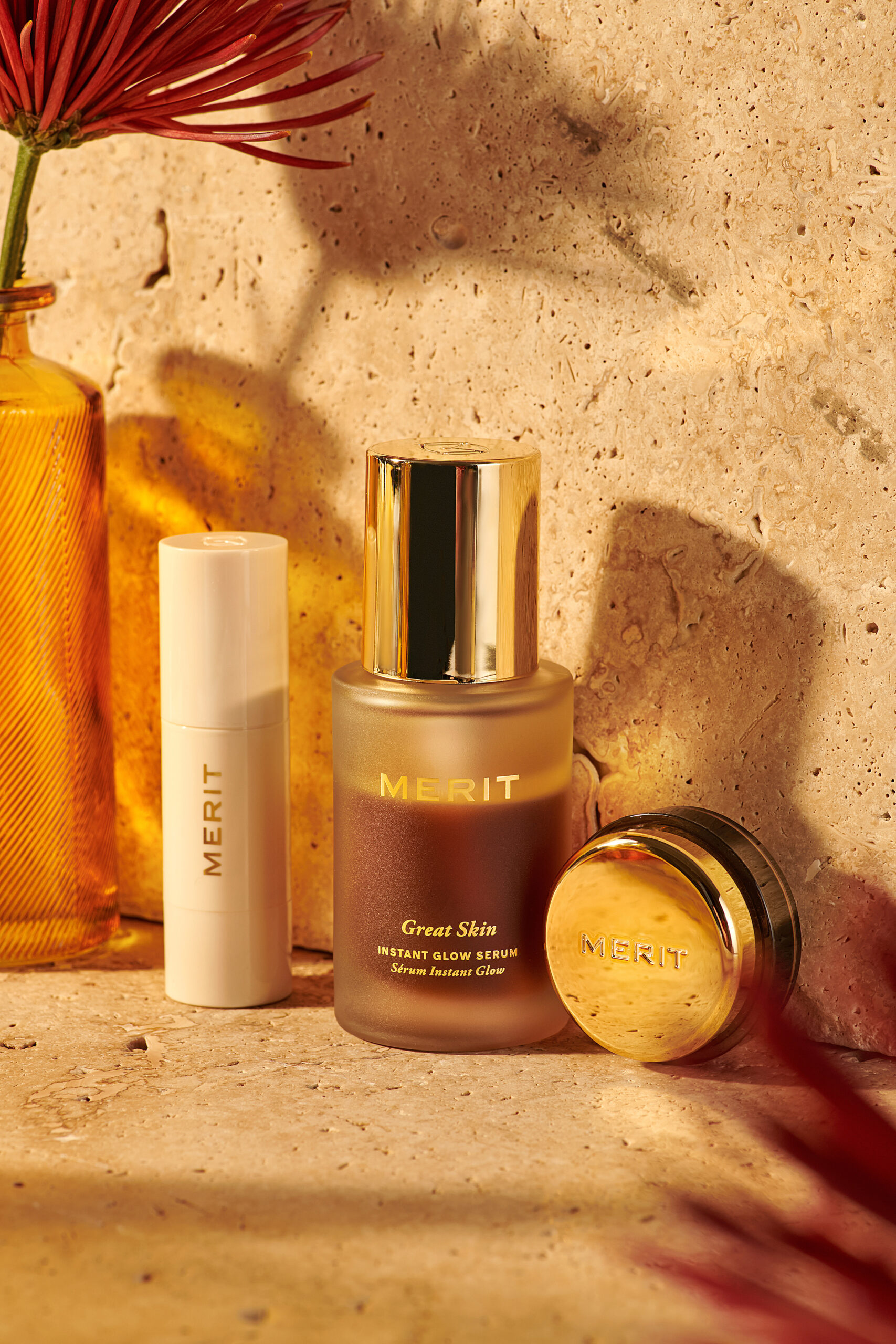
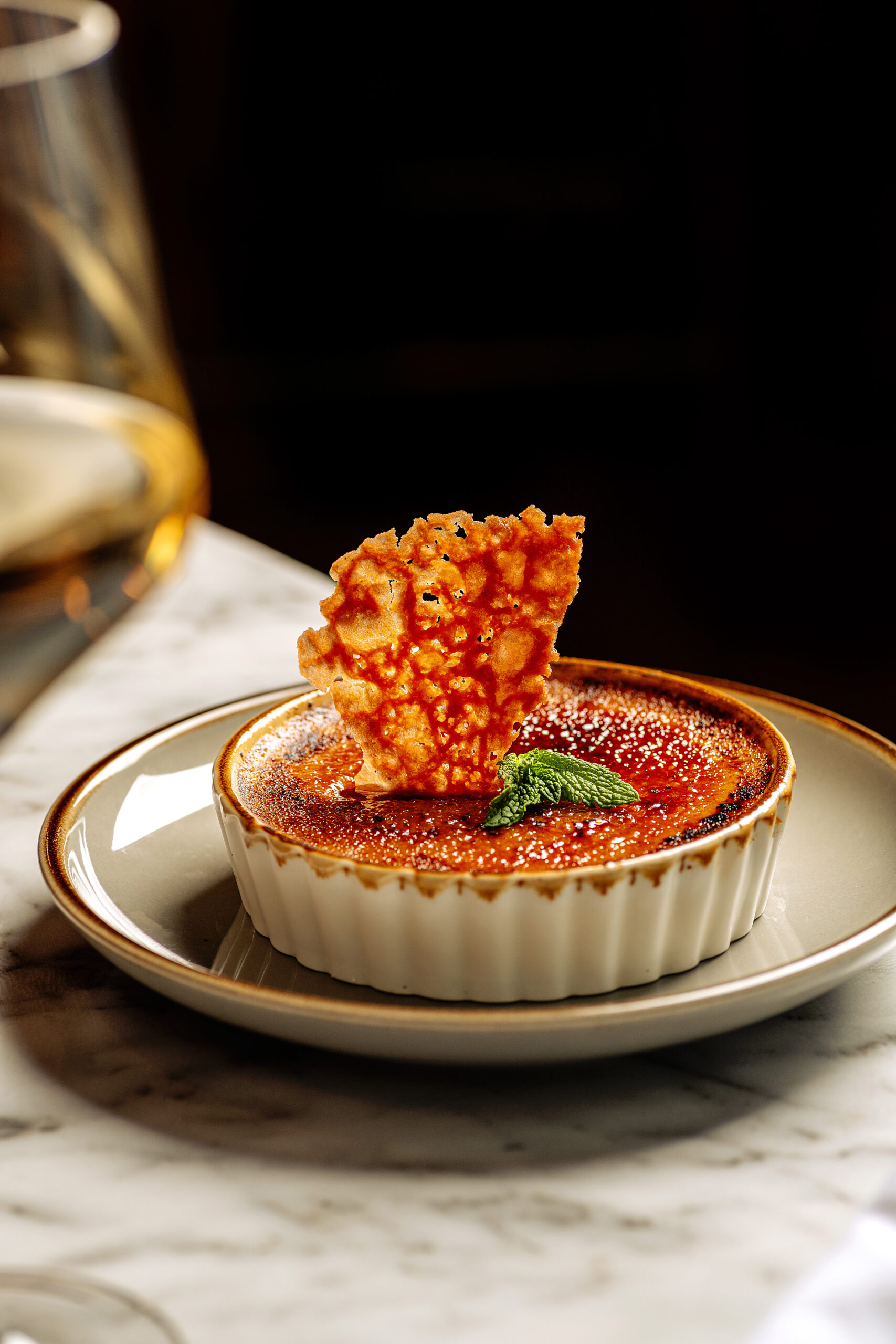
- Creativity: Food and product photography isn’t just about capturing meals—it’s about evoking emotions. Kelvin empowers you to manipulate mood through color temperature. Start with a neutral Kelvin setting (around 5000K-5500K) for accurate representation, then venture into warmer tones (e.g., 6400K) to infuse your images with golden hour warmth or sunset hues. It’s a subtle yet impactful way to engage viewers.
Practical Tips to Master Kelvin
- Hands-On Practice: The best way to familiarize yourself with the Kelvin scale is through hands-on experimentation. Venture outdoors during various times of the day, from sunrise to sunset, and observe how light influences color temperature. Notice how shadows and cloud cover impact the overall tone of your images.
- Live Mode Learning: If your camera supports live mode, utilize this feature to witness real-time changes as you adjust Kelvin values. This interactive approach enhances your understanding of how color temperature translates into visual aesthetics.
- Post-Shoot Evaluation: After a session, review your images and pay attention to how your chosen Kelvin settings influenced the mood and ambiance of each shot. Note any adjustments you’d make for future shoots, refining your understanding of color temperature.
Once you’ve gotten the hang of shooting in Kelvin, use it to make creative photography choices by controlling white balance settings. It’s amazing how the look and feel can change by adjusting the color temperature. For example, I love creating warm sunny vibes. My lights are set to daylight neutral (around 5500K), so I bump up the temperature to around 6000 or above to create that warm look. Use the following guidelines as a starting point when shooting in Kelvin:
- For a neutral color, set K to the color of the light
- For a warmer color, set K higher than the color of the light
- For a cooler color, set K lower than the color of the light
So, why dive into the Kelvin scale? Well, it’s not just about nailing the technical stuff—it’s about adding that extra oomph to your photos.
Think of Kelvin like your secret weapon for creating vibes. Want a cozy, warm feel? Dial it down to those lower Kelvin values. Need a crisp, cool look? Crank it up higher. It’s like choosing the right filter for your Instagram post, but way more customizable.
And the best part? Once you get the hang of it, playing with Kelvin becomes second nature. You’ll start seeing your photos in a whole new light (literally).
+ view the comments
